
Case study · Luxury furniture · Seattle, WA
DMAR Interiors
now looks the part.
DMAR Interiors is a Seattle studio: luxury furniture, with installation and finishing. Its old website didn't look the part. We rebuilt it so the furniture comes first, in the room it was made for.
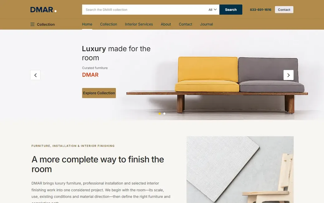 Before
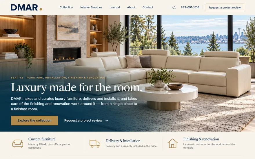 Now
- Business
- Luxury furniture studio
- Research to launch
- 2 days
- The site
- 181 products, from $2,530
- Google speed score, phone
- 61 → 91
1 · Before we started
Luxury furniture.
Last for looks.
We set the old site beside five national furniture brands: the same pages, names and logos hidden. It came last on every count. The pictures let it down most: products shown at different scales, on different backgrounds, some cut off.
One company's websiteDMAR Interiors' old site
2 · The old site
What a visitor ran into.
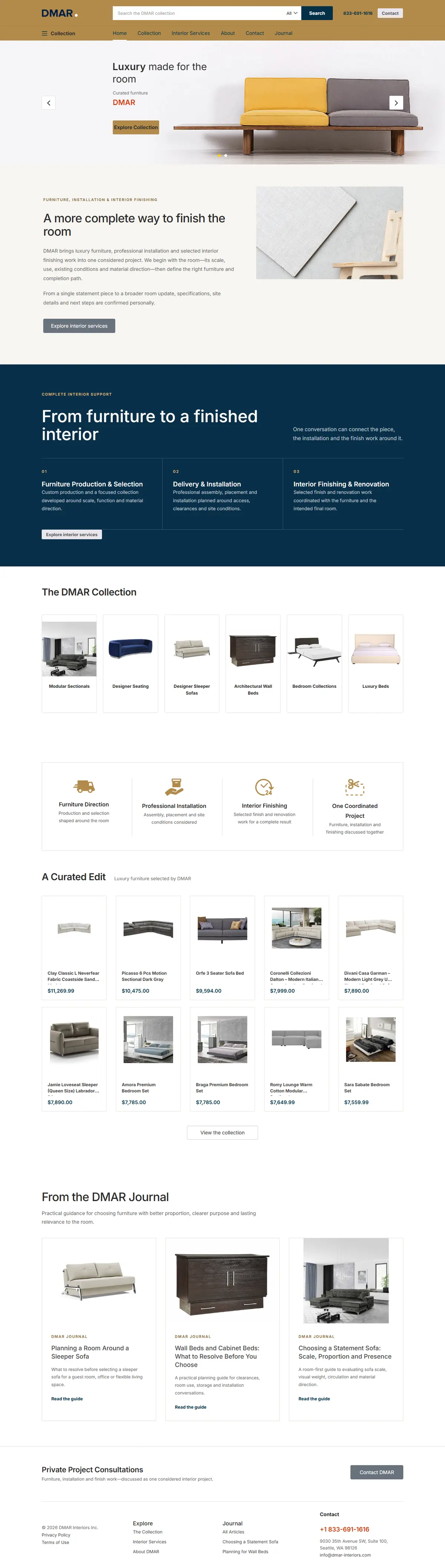

- Pictures that didn't say luxury.Products at different scales and on different backgrounds. A sofa filled a small part of a large card.
- Specs in a single line.Size, material, color and weight ran together.
- A catalog you could only sort.Categories were mixed together, with no filter for size, upholstery or configuration.
3 · Three designs
The first screen,
drawn three ways.
Three different ideas for one screen. Design B was chosen: the room across the whole screen, the furniture in the place it was made for.
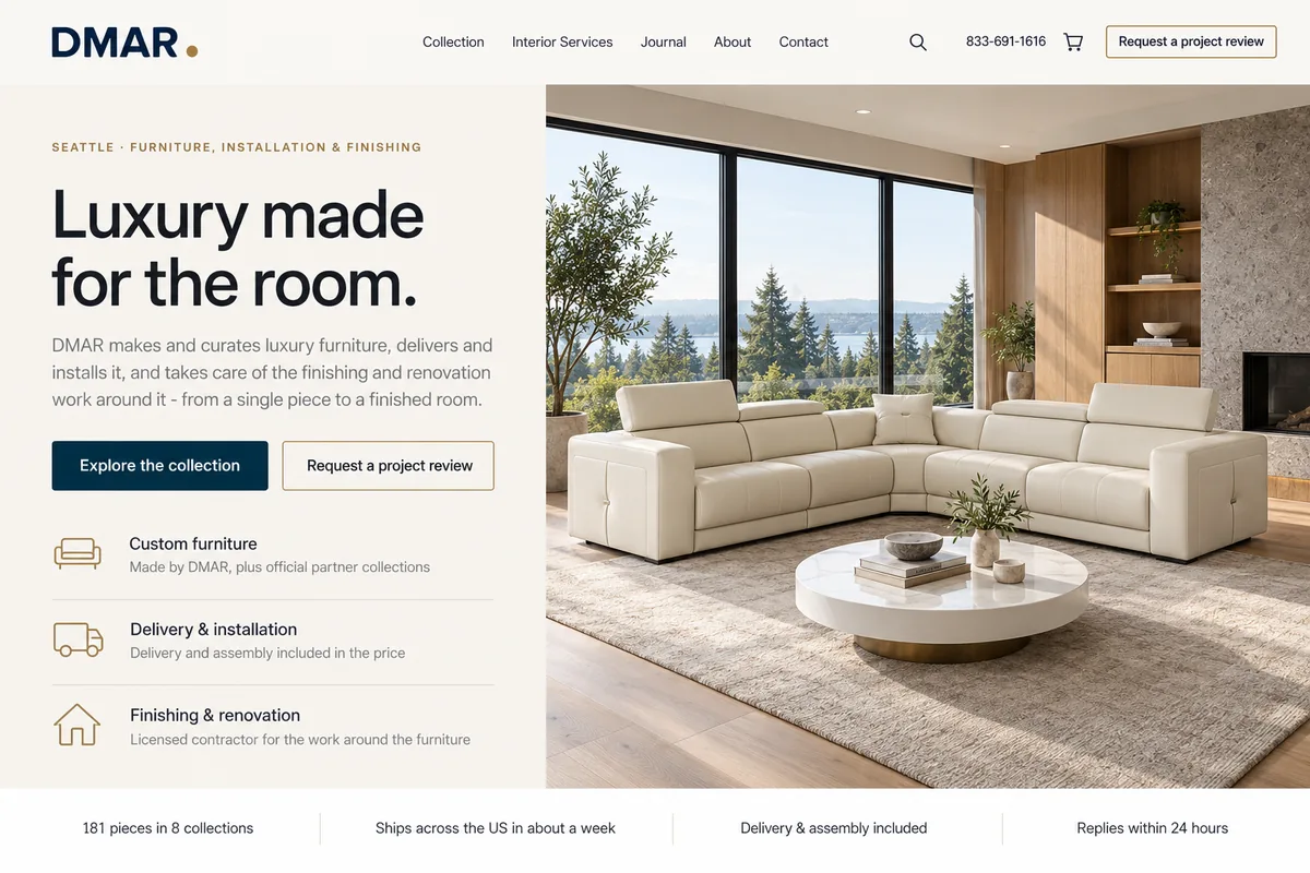 Design ALight and editorial, the text beside the room.
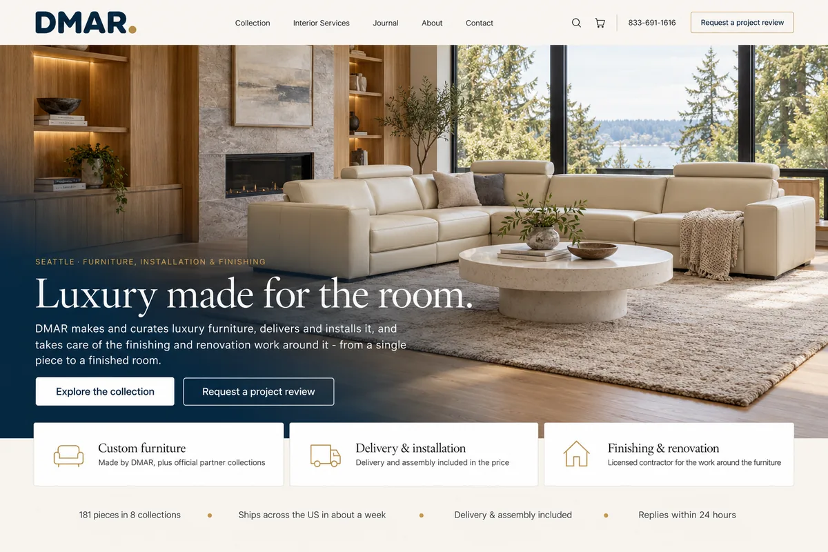 Design B · chosenThe room across the whole screen.
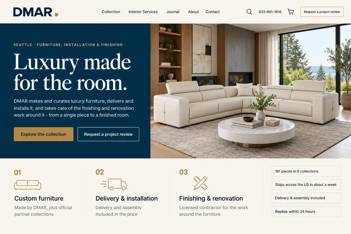 Design CNavy and gold, with a classic serif.
4 · The new site
What a visitor gets now.


- “Luxury made for the room.”Furniture, installation, finishing and renovation are presented as one project.
- 724 product pictures reworked.And a closed / open switch on 101 sofa beds and wall beds.
- A catalog you can filter.By price, sleeping size, upholstery and maker, applied the moment you choose.
The room scenes on the first screens were created around real products from the catalog.
5 · Measured
Every page faster.
Google's speed score on a phone, for seven kinds of page. Five of the seven are in Google's green zone, ninety and above.
BeforeNow
Home6191
Shop6090
Category6486
Product page4693
Services6287
Contact6396
Journal article6396
- 4.1 sslowest first screen on a phone, was 9.6 s
- 0.62 MBheaviest page, was 1.7 MB
- 16type sizes on the site, was 76
Google Lighthouse 12.6, phone mode: a mid-range phone on slow 4G. The old site was measured once, before launch. The new site's phone figures are the middle of three runs after launch.
 Biggy Piggy
 Bees Pro
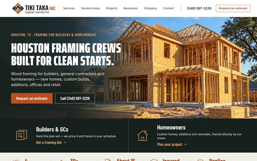 Tiki Taka
See your own website
tomorrow.
Three designs for your business in 24 hours. Free until you approve one.
A question first? Chat with us